Kults!
Hello again!
Yes it's that time...that time being "time to show some art and talk a load of shite" again.
Last time I was here I showed some cover sketches and ting from the Batman and Robin issues I did, and at the end I promised to return with some interior page sneak peeks.
Well, there's been a slight change in that plan. Not in a bad way as such, as I still plan to show some of that stuff to those of you who are enjoying peeking under the Wizard's skirt, but before I get here I have decided to show something different.
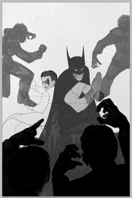
A little while ago I was asked very nicely if I would be interested in doing a variant poster for a movie called "MONSTERS". Being the shameless art-whore that I am, I said yes. I got a dvd of the flick, watched it, then set to scribbling some ideas. Here I present to you the final product along with the rejected ideas I had after watching the movie.

This is the final version. As u will see later, it's pretty close to one of my sketches, and that's the way I like it. I had to smooth out some bumps and creases on the figures before it was ready but in doing so I learnt a few new tricks when it comes to rendering skin.

This was an earlier rough of the final idea. I had been given suggestions to pull back from my sketch and show it more from above...this, I thought, reduced the dramatic engagement with the central characters and made it more of scenic piece (and I suck at scenery) which is why I was glad that we ended up reverting to the original sketch in close up.

Despite the movie beiong called MONSTERS I didn't think the tentacle was enough of a draw for the drama in the poster. The symmetry in the shadow was nice, and I even liked the foliage, but the figures were TINY.

Earlier sketches were very different. I liked the romance aspect of the movie and initially went for a vibe that focused on that instead of the sci-fi-beasty aspect. When/if you see the movie you will see where I was coming from.

One of my great moments of graphic inspiration (rare as they may be) I had this brilliant idea of kinda forcing a heart-shape into the image. Like, it's a romance, yes? So how about putting a big soppy heart in there? It's actually way harder than you would think to make a heart-shape out of two linked hands, but I tried.

Different angle here. I liked the contrast between the warm hands which are like all lovey-dovey and sweet and nice and hopeful, with the cold blue mess of the wrecked jungle and the ominous signs of Monsters, such as the sign post and wrecked vehicles etc.

A slight variation, rehashing an earlier pose. This time showing them in the jungle as opposed to approaching it, with some dramatic up-shots of wrecked buildings. Personally I wasn't so hot on this, as I really liked the tension of the earlier images as the couple approach the dangerous zone. It made them more heroic and sorta showed that the bond between them was stronger. This looks like they're just a bit lost on safari.

This sketch was the Chosen One. We ditched the sign post after a while, and replaced it with the tentacle. After all, there had to be something that said "Monster" in the image, and I wasn't sure that the looming shadow was enough. This shot does allow for more direct dramatic engagement with the characters, which is fair, even if I had to ditch my genius heart-shaped hands idea *grumble*.

This sketch was done with the idea that we will show the beasts in the background. It's less dramatic than the others, and the butt-shot is open for abuse across the internet.

The final sketch I offered up. It has all the ingredients I wanted in it (yes, I was even planning to highlight their heads to force a heart-shape in it) but it just wasn't very Ooomphy it seems. Still, it got me out of drawing lots of wreckage (am not a fan of wreckage).
There's a competition currently running to win signed copies of the poster at this website and you can all go watch the movie as well and then come back here and tell me which sketch you thought suited it best.
That's not all tho! After I did me Batman pages a few weeks ago I got another gig doodling a book cover for my mates at Solaris books. Essentially I had to design the character from the rough descriptions from the writer and make a design that would work as an intro to the series. I did 2 sketches, here is the one that made it.

Nice and simple, very much in keeping with what I normally do. The dude needing beefing up tho. "Imagine he had a very very very large paper-round" was the instruction.

Ok, he has more meat.

A little scribbling later and this is the b/w version. I modified my method during this, and this cover was my first proper experiment. I think it worked ok...

Final art sans text. This was leaked to Bleeding Cool yesterday and Rich Johnston added that I should return to drawing Gutsville now. HMPH! The audacity of the man! I am in fact currently doing just that, and will maybe post some previews and sneak peeks if you're nice. I'm looking at *you*, Johnston...
Many thanks also due to The Queen of Cakes for proofreading and correcting my atrocious typing xxx
posted by Frazer Irving at
09:34
4 Comments
![]()
![]()